
X-Ridercine | App
Seamless Ticketing: Your Hassle-Free Movie Experience!

Overview
OVERVIEW
The product:
The X-Ridercine is a ticket purchasing platform in the Belo Horizonte region of MG, designed to assist cinema enthusiasts facing issues such as queues and bureaucracy.
The app provides a simple and intuitive interface, with integrated IA artificial intelligence to enhance movie searches.
The problem:
Cinema fans face challenges when buying tickets, such as difficulty securing preferred seats in crowded theaters and enduring long lines at ticket counters, potentially leading to delays or even the inability to obtain tickets for the desired screening.
The goal:
Build an application to buy tickets in theaters in a simple and practical way.
My function:
UX Designer, designing the X-Ridercine application from end to end, that is, from conception to making tangible and delivering the final results.
Project duration:
3 months
Responsibilitys:
Conducting interviews, paper and digital wireframing, low and high fidelity prototyping, conducting usability studies and iterating on projects.
Discovery step
DISCOVERY
User Search:
I conducted interviews and created empathy maps to understand and get to know users, understanding their journeys and needs.
A group of users, identified through the survey, were workers who did not have time to buy tickets at the physical box office.
This same group confirmed the initial assumptions, and the research even revealed that time was not the only problem that users faced and that limited them from buying tickets.
Yes, other identified problems include other challenges that make it difficult to get to the cinemas as well, and among them several points were listed, such as huge queues, forgetting to go to the cinemas on the day scheduled, in addition to queues even to enter the cinemas.
pain points
PROBLEMS


Persona
PERSONA
Problem statement:
At 27 years old, Lucas Barros is an avid fan of comics and superhero movies. He urgently requires more efficient ways to purchase movie tickets because time is not his ally. This time constraint often leads to him missing the premieres of his most anticipated releases.

journey map
JOURNEY MAP

Summary:
Lucas's journey mapping, revealed to be useful for the
users have access to a purchase application
custom tickets.
Draft
PAPER WIREFRAME
Summary:
Taking the time to sketch out the iterations of each app screen on paper quickly showed the solution process to help users save time and make it easier for them to purchase tickets.

The stars were used to mark the elements of each sketch that would be used in the initial digital wireframes.
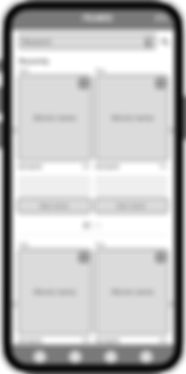
Digital wireframe
DIGITAL WIREFRAME

Summary:
Based on the collected feedbacks, improvements were applied to the digital wireframe.

Usability Study | Discoveries
USABILITY STUDY
Summary:
Conducted two rounds of usability studies, where I obtained several findings and applied improvements according to guidance through low and high fidelity prototype. This revealed to me aspects that needed to be improved.
1st round of discovery
the users want to buy tickets conveniently.
They want more payment options.
The payment process has many steps.
2nd round of discovery
They would like access via a QR code reader
I would like to receive more tips and register your opinionss.
style guides
STYLE GUIDE
Typography
This a neutral, flexible, sans serif font is the system font for iOS, iPad OS, macOS, and tvOS. SF Pro includes nine weights, variable optical sizes , and a rounded version for better readability.

Color Pallet
The color orange means joy, vitality, prosperity and success.
It is a warm color resulting from mixing the primary colors red and yellow.
It is associated with creativity, as its use awakens the mind and helps in the process of assimilating new ideas.
Navy blue also conveys confidence, loyalty, security and respect. Therefore, it is perfect for work environments and for logos.
It's a hue that helps expand the creative side, but without losing focus.
The navy blue color also symbolizes: loyalty, wisdom, sincerity, truth, faith and intelligence.

Components UI Library
Some of the components used to compose the application interfaces.

Mobile Grid Layout
Grid of 4 columns for mobile app 360x800

Mockup
MOCKUPS
Summary of the 1st test performed:
The Design was revised and improvements were applied not only to the
visual system, but also in functionality, making it clearer for users.
All this brought more benefits to users, generating more identification and
improving the experience of each one of them.
Before
After

Summary of the 2nd test performed:
The second test revealed a certain frustration in the search tab, as well as the
detail view button that was small to the touch.
I changed the positioning of the shopping cart, giving more of this in the lower
navigation bar, as it is a page.
I also removed some elements and excess information inside the cards.
Before
After


Learnings
LEARNINGS
Impact:
The app makes users feel more confident due to its ease of use.
A feedback quote:
"The app has revolutionized the movie ticket purchasing experience, making it intuitive and efficient, accessible in just a few clicks."
What I learned:
The importance of maintaining a balance between functionality and simplicity.
The need to pay attention to user feedback for continuous adaptations.
Next steps:
Explore partnerships with cinemas to offer exclusive discounts to app users.
Continue monitoring feedback for continuous improvements.
Measure monthly user base, download rate, and retention rate.
Implementing a cinema environment customization system that utilizes artificial intelligence to analyze user preferences and suggest theaters with more comfortable seating, optimal temperature, and superior sound and image quality.
Allowing users to reserve specific seats in advance, ensuring the best viewing experience.
Providing personalized combo options with food and
beverages based on the user's tastes and the type of
movie they are watching.
Thanks!
THANK YOU!
see more works
OTHER JOBS

